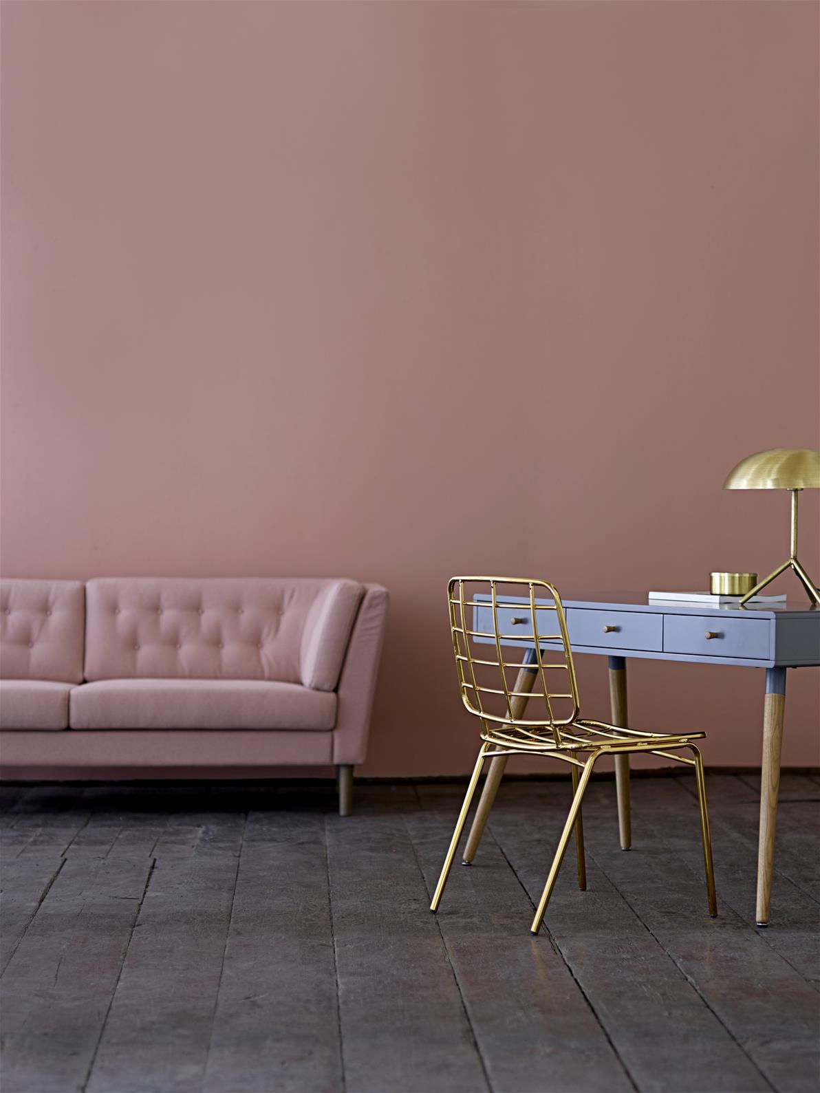
This year, Pantone have selected not one, but two, colours of the year. For 2016, we’re looking at rose quartz and serenity (aka dusky pink and pale blue) as the colours to watch. Blending two shades together for the first time is a big change for Pantone and is a very contemporary spin on pastels. Apparently chosen in response to consumers seeking mindfulness and well-being as an antidote to the stresses of modern day life, Pantone said this “harmonious pairing of inviting shades embody a mind-set of tranquility and inner peace”.
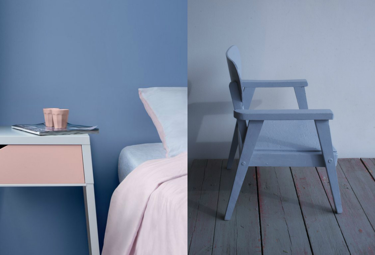
We’ve had lots of fun putting together a selection of all our stock that fit in with the mood. Take a look at our Pinterest board TREND – Pantone Colour of the Year and peruse our website to see more. From moody blue antique sideboards to delicate pale pink vintage glass shades, there is lots to choose from to update your home.
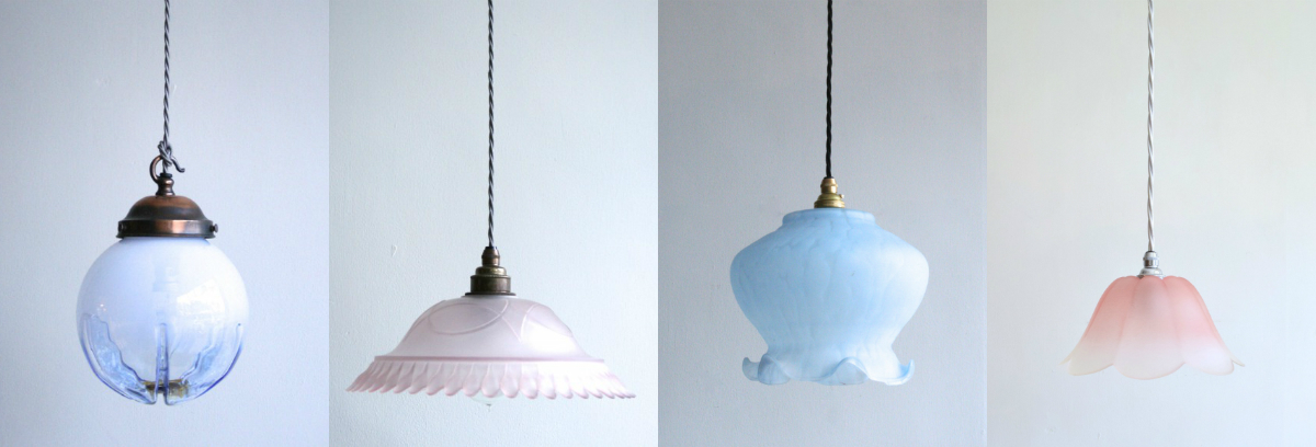
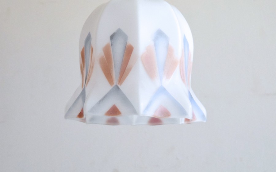
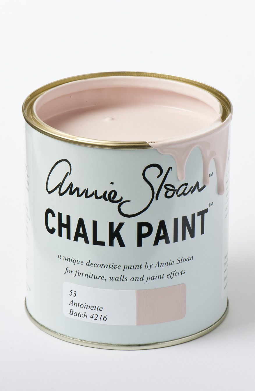
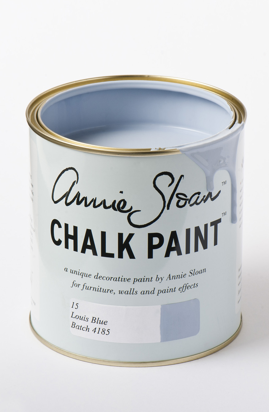
Incorporating the colours into your home can be as easy as adding a vintage pendant shade but, if you’re feeling particularly hands on, we stock Annie Sloan Chalk Paint™ in Antoinette and Louis Blue; both of which are great matches for the Pantone shades and are a brilliant (and easy) way to update a tired looking piece of furniture. If you’re a novice to painting projects, but would love to have a go, we regularly run introductory technique workshops in our lovely shop not far from Manchester.
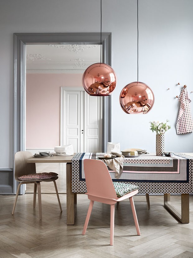
And for a really cutting edge interpretation of this pair of pastels, this striking image from Casa Vogue uses them as a backdrop for the metallic finishes of the minute – copper and rose gold. You can achieve this look for yourself by investing in some of our large range of industrial shades and a can of metallic paint spray from our friends at Fred Aldous.